Thursday, November 12, 2015

Type figures using Adobe InDesign


In this project, we created type figures our letters and shapes that are related, irony or sarcasm.

1. This a shape of a snowman made out of 3 C's, 3 O's and 2 I's.


 2. In this short sentence, I capitalized the S for the related sentence of a river.


 3. I wrote a short story about flowing down a river and I used the pen tool to make the river shape and put and fit it in the page.


4. I made a illustration of a wink.


selecting Text in Adobe InDesign

In this project, we demonstrated the steps in selecting text.

1. (click and drag). It selects what you want.
2. (1 click) it clicks the part that you want to type.
3. (2 clicks). Selects a word.
4.(2 clicks and drag). it selects word per word.
5.(3 clicks). selects a line.
6.(3 clicks and drag). It selects line per line.
7.(4 clicks) selects a paragraph.
8.(4 clicks and drag). selects        paragraph per paragraph.
9.(5 clicks) selects the whole page or text.
10.(5 clicks and drag). selects the whole text.

Thursday, November 5, 2015

logo design and layout stages

INTRODUCTION

In this project, I learned the true meaning of Gestalt. It means an organized whole that is perceived as more than the sum of it's parts.
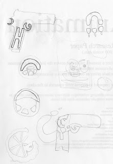
THUMBNAILS
I drew and created 20 thumbnail sketches included my initials in all 20 sketches. They are rough sketches for practice and interpretation.


1. A Handgun
2 . A steering wheel
 3.  A Tire

4. A Paw
5. A moon
6. A baseball
7. A circle
8. A bag
9. A Mask
10. A letter
11. A gorilla
12. A hand with a heart
13. A pizza
14. 3 fruits
15. A alarm
16.  A controller
17. A badge
18. A Calculator
19. A glove
20. A Car
 
Gestalt is an image that makes 2 images in one, it could made out of someone's initials, face, animals and it could make something out of it.
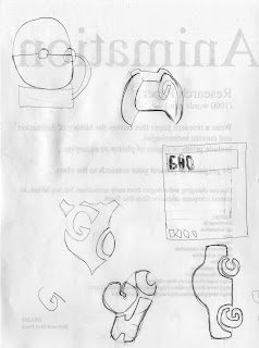


 ROUGHS

In this part, I redrew my 2 best rough gestalt images. One was a boxing glove with my 3 initials  GHC). The 2nd is a badge with my 2 initials (GC).


In the final comprehensive, I smoothed and edited my final gestalt and created my initials better so it would look professional.


Tuesday, October 20, 2015

Raster RGB and Indexed increased resolution quality comparison

RGB
In this assignment, there 2 Sony logos, one is RGB and the other is indexed color. The RGB image has straight curved lines, it's a little blurry and has some quality. 


The second image is smudged, has static lines has good quality but it needs some fixing.


Indexed

Tuesday, October 13, 2015

Vector File size comparison

In this assignment,  I used my selfie photo to image trace the photo.

The first image is 3 colors of image trace and is expanded and doesn't a lot nor too little points. The file size is 207 KB.


 This photo is image traced with high fidelity and expanded which is filled and covered with a lot of points. The file size is 2.1 MB because it has a lot of points which makes it bigger.


This photo is curved line that has 2 points with a 10 point stroke. The file size is 1.6 MB.

Tuesday, October 6, 2015

vector self portrait


 This assignment was about the converting the images from raster to vector. The pictures no longer have pixels that's why they are now vector.
black and white

Raster uses pixels for the image and Vector uses areas, selects colors and doesn't use pixels. 

The first image, I increased the saturation and contrast, then I used image trace to create the other images which black and white, 16 colors and sketched art. 

         16 colors
sketched art

vector logo

In this assignment, we were given the copies of 4 logos that had bad quality and we were told to fix the quality of the logosAlso the image went from raster to vector which removes the pixels.

I first open adobe illustrator, opened up the images and i resized the images to fit into the space in a square size. I didn't stretch nor expand because it will cause damage to the logo. Then i selected an image trace that would fix the quality of the logo. All the images are high fidelity, which the quality of the logo was fixed and corrected. 
Once i fixed it, i saved the logos as AI in a file and JPG for the blog.