In this project, i made my own book cover of an existing book. I had to use my own creations including taking photos and editing the images and cover.
Step 1: i took photos of the American flag, a navy seal trident and a sniper rifle.
Step 2: I emailed the photos to myself to start editing the images and overlapping it to move it to the book cover.
Step 3: I finished the book cover, edited and checked for any mistakes or so and I print it to turn the project in.
Tuesday, December 8, 2015
My type figures
In this assignment, i used my type figure that i created to make it into a booklet. I put the top images backwards so it wouldn't come out backwards when i fold it.
Tuesday, December 1, 2015
My type assignment
In this project, I used created type figures to make symbols and words.
1. I used the word excellent and replaced the "x" with a knife and fork crossing and making an X symbol.
2. I used the letter O and replaced the middle spacing with a buzz saw.
3. I used the word sunflower and replaced the o with a sunflower image that related to the word.
4. I used an image and a exclamation that represents, " Grenade!". Which means if a grenade was thrown, you would yell out grenade to warn everybody else.
5. I combined 2 photos to make a phrase which is " paint bucket."
6. I used a word and an image to interact.
7. I illustrated a word that is separated.
Thursday, November 12, 2015
Type figures using Adobe InDesign
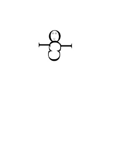 In this project, we created type figures our letters and shapes that are related, irony or sarcasm.
1. This a shape of a snowman made out of 3 C's, 3 O's and 2 I's.
2. In this short sentence, I capitalized the S for the related sentence of a river.

3. I wrote a short story about flowing down a river and I used the pen tool to make the river shape and put and fit it in the page.
4. I made a illustration of a wink.
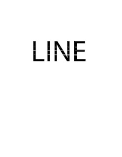
selecting Text in Adobe InDesign
In this project, we demonstrated the steps in selecting text.
1. (click and drag). It selects what you want.
2. (1 click) it clicks the part that you want to type.
3. (2 clicks). Selects a word.
4.(2 clicks and drag). it selects word per word.
5.(3 clicks). selects a line.
6.(3 clicks and drag). It selects line per line.
7.(4 clicks) selects a paragraph.
8.(4 clicks and drag). selects paragraph per paragraph.
9.(5 clicks) selects the whole page or text.
10.(5 clicks and drag). selects the whole text.
Thursday, November 5, 2015
logo design and layout stages
 INTRODUCTION
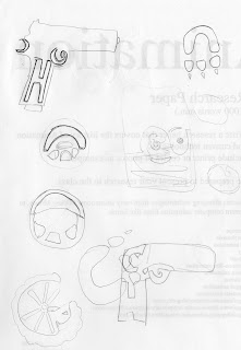
In this project, I learned the true meaning of Gestalt. It means an organized whole that is perceived as more than the sum of it's parts.
THUMBNAILS
I drew and created 20 thumbnail sketches included my initials in all 20 sketches. They are rough sketches for practice and interpretation.
1. A Handgun
2 . A steering wheel
3. A Tire
4. A Paw
5. A moon
6. A baseball
7. A circle
8. A bag
9. A Mask
10. A letter
11. A gorilla
12. A hand with a heart
13. A pizza
14. 3 fruits
15. A alarm
16. A controller
17. A badge
18. A Calculator
19. A glove
20. A Car
 Gestalt is an image that makes 2 images in one, it could made out of someone's initials, face, animals and it could make something out of it.
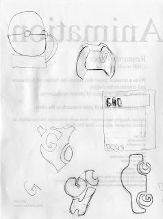
ROUGHS
In this part, I redrew my 2 best rough gestalt images. One was a boxing glove with my 3 initials GHC). The 2nd is a badge with my 2 initials (GC).
In the final comprehensive, I smoothed and edited my final gestalt and created my initials better so it would look professional.
Tuesday, October 20, 2015
Raster RGB and Indexed increased resolution quality comparison
Tuesday, October 13, 2015
Vector File size comparison
In this assignment, I used my selfie photo to image trace the photo.
The first image is 3 colors of image trace and is expanded and doesn't a lot nor too little points. The file size is 207 KB.

This photo is image traced with high fidelity and expanded which is filled and covered with a lot of points. The file size is 2.1 MB because it has a lot of points which makes it bigger.

This photo is curved line that has 2 points with a 10 point stroke. The file size is 1.6 MB.
The first image is 3 colors of image trace and is expanded and doesn't a lot nor too little points. The file size is 207 KB.

This photo is image traced with high fidelity and expanded which is filled and covered with a lot of points. The file size is 2.1 MB because it has a lot of points which makes it bigger.

This photo is curved line that has 2 points with a 10 point stroke. The file size is 1.6 MB.
Tuesday, October 6, 2015
vector self portrait
This assignment was about the converting the images from raster to vector. The pictures no longer have pixels that's why they are now vector.
 |
| black and white |
Raster uses pixels for the image and Vector uses areas, selects colors and doesn't use pixels.
The first image, I increased the saturation and contrast, then I used image trace to create the other images which black and white, 16 colors and sketched art.
vector logo
 In this assignment, we were given the copies of 4 logos that had bad quality and we were told to fix the quality of the logos. Also the image went from raster to vector which removes the pixels.
I first open adobe illustrator, opened up the images and i resized the images to fit into the space in a square size. I didn't stretch nor expand because it will cause damage to the logo. Then i selected an image trace that would fix the quality of the logo. All the images are high fidelity, which the quality of the logo was fixed and corrected.
Once i fixed it, i saved the logos as AI in a file and JPG for the blog.
Thursday, October 1, 2015
semiotics logo
DISCUSSION
This logo is the album cover of the heavy metal band Slipknot. It has 3 colors, black, gray and white. The symbols an S that is symbolized, a pentagram behind the S and the text. The text says, "All hope is gone", the name of their 4th album
The 2 symbols in this logo, the S is symbolized . The pentagram is a circle with a star overlapping the circle and numbers that degrees. Both of these symbols have been used for the band since 1999. The S is an identity of their band, a persona some would say. This symbolized S has never been used in any other matters, it's owned by the company of road runner records that produces and directs the band slipknot. The pentagram
Thursday, September 24, 2015
LIQUIFY FILTER
Intro
In this photo. the filter that was used in this selfie photo was the forward warp tool, pucker and bloat tool.

The forward warp tool drags, expands or moves parts of the photo.
The reconstruct tool fixes the part that you expanded or moved.
The pucker tool shrinks the part of the photo that you want
The bloat tool expands the part you want to expand.
The push left tool moves or pushes the part of the photo.
The hand tool moves the photo around
The zoom tool zooms into the photo in or out to get a better look.
GIF COLORS AND QUALITY
Tuesday, September 22, 2015
JPG COMPRESSION AND FILE SIZE
 |
| Q100 |
This assignment is using a selfie picture, and using the filter to experiment the setting and observing the changes.
Discussion
This picture's quality is 100 which it doesn't show the pixels and the file size is 39 KB because it did not changed much and the quality of this picture is good and not damaged.
Disscussion
This picture's quality was lowered to 60, it may not be noticeable but the face in the picture is noticeable. Since the quality is lower, the file size was lowered to 15 KB since it was changed and lowered.
Disscusion
This picture's quality is 0 flat, the whole picture's pixels is noticeable and the picture is damaged. The file size of this picture is 5 KB because it has no quality.
Tuesday, September 15, 2015
layers and compositing
DISCUSSION
This photo of overlapping images is a assignments of Layers and Compositing. I used the magic wand on these images to erase the background of these 6 images which had no pixels in the background. I used the rectangular tool to copy and paste the images into one place to overlap and renamed the layers so I wouldn't get confused which was which. This images tell a story about a film reel which is a movie which includes stars and goldfish which means it will be a great movie because movies criticize by stars and shades of metal (Gold). The lightbulb signifies someone has an idea and the "sheep" is calling to criticize the movie or director.
Tuesday, September 1, 2015
semiotics
My image is a symbol of 2 persons and one of them is handicapped and a number. Semiotics is the science of signs which has 3 categories: Iconic, Indexical, Symbolic. Iconic is what it represents, signifies and looks like. Indexical is the cause and effect. Symbolic is the signs that have to be learned.
Thursday, August 27, 2015
color mode exercise
Bitmap
Bitmap has only 2 colors which makes it the smallest file, 2.8k. The output is 300 and 50% threshold which 2 colors will always appear as black and white.
Grey Scaled
The Gray Scaled is the second smallest file by 22.9k. It's a little higher because grey has 256 shades same as RGB.
Indexed Color
Indexed color is limited to 4-12 and its 9. The file size is 59.4k a lot higher because it includes a lot more colors in Indexed.
RGB
It's the highest file size by 2.22m because its the normal mode of the photo. It has 16.7 million colors to create the image in this mode.
PS: Color Modes: Worksheet/Quiz
1. Can you change FILE FORMAT just by changing it's name? Discuss
No because it will confuse the computer and errors can occur.
2. How many colors are in the following COLOR MODES?
RGB: 16.7
Indexed Color: 0-256
Greyscale: 256
Bitmap:2
3. What happens to the (uncompressed) FILE SIZE as you change the COLOR MODES. Discuss
It lowers the file size, because it has less colors and size.
4. What happens to the visual quality of images as you REDUCE the number of colors by changing the color mode?
It changes and loses its quality and data.
5. What is a good reason to convert PSD files to JPG?
To use it for delivery.
Subscribe to:
Comments (Atom)


