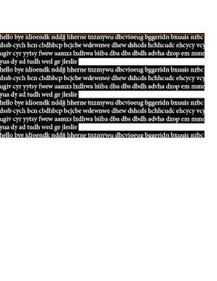
In this project, i made my own book cover of an existing book. I had to use my own creations including taking photos and editing the images and cover.
Step 1: i took photos of the American flag, a navy seal trident and a sniper rifle.
Step 2: I emailed the photos to myself to start editing the images and overlapping it to move it to the book cover.
Step 3: I finished the book cover, edited and checked for any mistakes or so and I print it to turn the project in.
Geri's graphic blog
Tuesday, December 8, 2015
My type figures
In this assignment, i used my type figure that i created to make it into a booklet. I put the top images backwards so it wouldn't come out backwards when i fold it.
Tuesday, December 1, 2015
My type assignment
In this project, I used created type figures to make symbols and words.
1. I used the word excellent and replaced the "x" with a knife and fork crossing and making an X symbol.
2. I used the letter O and replaced the middle spacing with a buzz saw.
3. I used the word sunflower and replaced the o with a sunflower image that related to the word.
4. I used an image and a exclamation that represents, " Grenade!". Which means if a grenade was thrown, you would yell out grenade to warn everybody else.
5. I combined 2 photos to make a phrase which is " paint bucket."
6. I used a word and an image to interact.
7. I illustrated a word that is separated.
Thursday, November 12, 2015
Type figures using Adobe InDesign
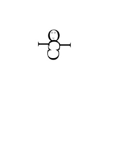 In this project, we created type figures our letters and shapes that are related, irony or sarcasm.
1. This a shape of a snowman made out of 3 C's, 3 O's and 2 I's.
2. In this short sentence, I capitalized the S for the related sentence of a river.

3. I wrote a short story about flowing down a river and I used the pen tool to make the river shape and put and fit it in the page.
4. I made a illustration of a wink.
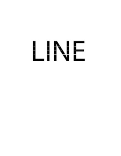
selecting Text in Adobe InDesign
In this project, we demonstrated the steps in selecting text.
1. (click and drag). It selects what you want.
2. (1 click) it clicks the part that you want to type.
3. (2 clicks). Selects a word.
4.(2 clicks and drag). it selects word per word.
5.(3 clicks). selects a line.
6.(3 clicks and drag). It selects line per line.
7.(4 clicks) selects a paragraph.
8.(4 clicks and drag). selects paragraph per paragraph.
9.(5 clicks) selects the whole page or text.
10.(5 clicks and drag). selects the whole text.
Thursday, November 5, 2015
logo design and layout stages
 INTRODUCTION
In this project, I learned the true meaning of Gestalt. It means an organized whole that is perceived as more than the sum of it's parts.
THUMBNAILS
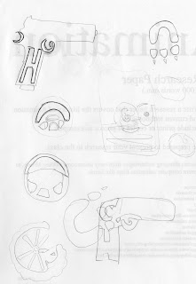
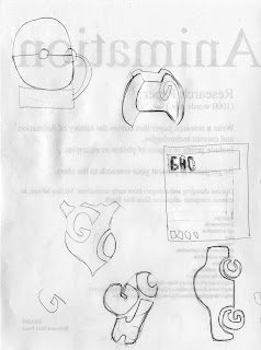
I drew and created 20 thumbnail sketches included my initials in all 20 sketches. They are rough sketches for practice and interpretation.
1. A Handgun
2 . A steering wheel
3. A Tire
4. A Paw
5. A moon
6. A baseball
7. A circle
8. A bag
9. A Mask
10. A letter
11. A gorilla
12. A hand with a heart
13. A pizza
14. 3 fruits
15. A alarm
16. A controller
17. A badge
18. A Calculator
19. A glove
20. A Car
 Gestalt is an image that makes 2 images in one, it could made out of someone's initials, face, animals and it could make something out of it.
ROUGHS
In this part, I redrew my 2 best rough gestalt images. One was a boxing glove with my 3 initials GHC). The 2nd is a badge with my 2 initials (GC).
In the final comprehensive, I smoothed and edited my final gestalt and created my initials better so it would look professional.
Tuesday, October 20, 2015
Raster RGB and Indexed increased resolution quality comparison
Subscribe to:
Comments (Atom)


